Dealing With Responsiveness
- Details
Responsive web design has solved an enormous number of problems. It has also created a few interesting ones.
A modern website can rearrange itself to fit everything from a large desktop monitor to a phone being held vertically by somebody standing in line at the supermarket. Navigation collapses, columns stack, photographs resize, text reflows and, with a little luck, everything remains usable.
Advertising has to come along for the ride.
That sounds straightforward enough. After all, an image can be resized with CSS. Give it a maximum width of 100 percent, preserve the aspect ratio and the browser will dutifully make it smaller when there isn't enough room.
Technically, problem solved. Visually, perhaps not.
A Smaller Advertisement Is Not Necessarily a Better Advertisement
During the development of WayPointAds, we had already spent considerable time making Zones behave properly on different screen sizes. Smart Zones could respond to the space available to them, text wrapping could be abandoned when a screen became too narrow, and advertisements could adapt as a visitor moved between desktop and mobile layouts.
There was, however, one part of the equation that WayPointAds couldn't magically solve. The advertisement itself.
Consider a wide banner designed for a desktop website. It might contain a company logo, a photograph, a promotional message, a telephone number and perhaps a call to action. At its intended size, everything looks wonderful but now shrink the entire thing until it fits on a phone.
The photograph is still there. The logo is still there. The text is technically still there but you may require the eyesight of a peregrine falcon to read it. Responsive design had successfully made the advertisement fit the screen while simultaneously making the advertisement considerably less useful.
We Could Have Left It Alone
There is always a temptation during software development to say, "That's the advertiser's problem." After all, WayPointAds had done its job. The Creative had been displayed. The browser had resized it correctly. Nothing overlapped, escaped its container or caused the page to fall apart.
The Chrome Hammer could inspect it and find nothing technically broken. Unfortunately, humans don't browse websites technically. They look at them.
If an advertisement contains lettering that becomes microscopic on a phone, telling the advertiser that the image has been successfully rendered at the correct responsive dimensions isn't going to make the lettering any easier to read.
So we started considering another approach. What If There Were Two Images? The answer turned out to be pleasantly uncomplicated.
Rather than asking one image to perform equally well everywhere, why not allow an image Creative to contain an additional image specifically for smaller screens? The main image could remain designed for its intended desktop Zone. It could take advantage of the available width and include the design, wording and detail appropriate to that space. The smaller-screen image could be designed differently. Not merely shrunk. Designed differently.
That distinction became important.
A mobile version might use larger lettering, fewer words, a simpler photograph or graphic, a more prominent logo and a clearer call to action. Information that works perfectly well across a large horizontal banner doesn't necessarily belong in the same arrangement on a narrow display, so instead of forcing the desktop advertisement to become increasingly tiny, WayPointAds could display artwork actually intended for the space available.
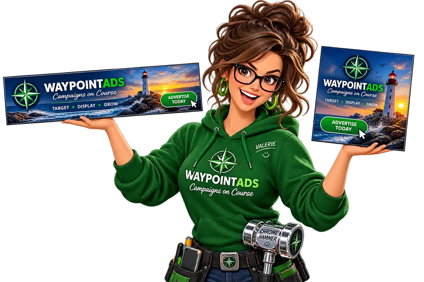
Same Advertisement, Different Creatives
The solution does involve two Creatives, but each has a specific job.
The primary Creative is designed for the normal Zone dimensions and larger displays. The additional Creative is designed specifically for smaller screens, where simply shrinking the original artwork might leave text difficult to read, details difficult to see and the overall advertisement considerably less effective.
Both can carry the same advertising message, branding and destination, but their artwork can be designed independently for the space in which it will actually appear. The smaller Creative might use larger lettering, fewer words, a tighter image or a simplified layout rather than attempting to squeeze everything from the desktop version onto a phone.
WayPointAds will then choose the appropriate Creative according to the available screen size.
The advertiser isn't being asked to create an entirely separate Campaign simply to accommodate mobile visitors. Instead, two purpose-designed Creatives can serve the same advertising objective, with each doing the job it was designed to do.
Why Not Automatically Crop It?
We considered what WayPointAds should and shouldn't try to decide for the advertiser. Automatic cropping sounds clever until the software decides that the least important part of an advertisement is the company logo. Likewise, stretching an image into a different aspect ratio can produce results that range from slightly unfortunate to something resembling a photograph reflected in a carnival mirror.
Artificially rearranging the contents of finished advertising artwork isn't really the advertising manager's job. The person creating the advertisement knows what matters.
If the headline needs to become larger, they can make it larger. If secondary wording can disappear on mobile, they can remove it. If the photograph needs a tighter crop, they can choose the crop. If a horizontal design needs to become something much simpler, they remain in control of that decision.
WayPointAds merely gives them somewhere to put it because sometimes the smartest thing software can do is know when not to be clever.
And We Kept the Measuring Tape
WayPointAds already validates uploaded Creative images against the dimensions required by their Zones. That feature exists for a simple reason. Allowing an incorrectly sized banner into a fixed advertising position and hoping CSS will sort everything out later is an excellent way to manufacture display problems.
If a Zone expects particular dimensions, WayPointAds checks the uploaded artwork before allowing the Creative to be saved. Adding another image didn't mean abandoning that philosophy. The smaller-screen artwork still needs to be appropriate for the job it has been given. The objective isn't to replace predictable advertising dimensions with a bucket marked "Chuck Something Mobile-ish In Here."
Responsive behavior should make advertising more flexible without making it unpredictable.
The Phone Is Not a Tiny Desktop
That may be the most important lesson behind the change.
For years, responsive web development has sometimes treated mobile devices as though they were simply very small desktop monitors. Most of us already know that they aren't.
People hold them differently. They view them from different distances. They interact with them differently. The available space changes dramatically between portrait and landscape orientations, and a design that looks perfectly comfortable at 970 pixels wide can become absurd when compressed into a fraction of that width. Advertising needs to acknowledge that.
A visitor shouldn't have to pinch and zoom an advertisement just to discover what somebody is trying to sell them, and an advertiser shouldn't have to sacrifice a good desktop design simply because the same Creative may occasionally appear on a phone.
Giving the Creative an additional image provides a fairly old-fashioned solution to a modern problem: Use the right tool for the job.
Another Small Change With a Larger Purpose
Adding support for a second Creative wasn't about introducing another clever feature simply because we could. We had seen a genuine problem. An advertisement designed for a large screen could be displayed perfectly well on a phone, but shrinking it enough to fit could make the wording difficult to read and the design much less effective.
The obvious solution was to stop asking one piece of artwork to do two very different jobs.
WayPointAds can now use a Creative designed for the normal Zone size and another designed specifically for smaller screens. The advertiser remains in control of both designs, while WayPointAds takes care of displaying the appropriate one.
It is a relatively small addition, but it solves the problem where it should be solved: in the advertisement itself, rather than trying to make CSS perform miracles with artwork that was never designed for a tiny screen.
Sometimes responsive design doesn't need another complicated algorithm. Sometimes it just needs a second picture.

WaypointAds is a modern advertising solution for Joomla that makes it easy to create campaigns, manage advertisers, organize creatives, and display ads across your website. Built for simplicity, flexibility, and growth, it gives you the tools to keep your advertising running smoothly from a single, intuitive interface.
